Accolades

Friday, June 26, 2015

Down by the Sea

Hello All!

Today's card is all about the beach! To me the beach means relaxing and colorful Adirondack chairs and, being from Michigan, lighthouses.  According to Pure Michigan's website (the official travel site for our state) has more lighthouses then in any other state. Each one is unique and grand in its own way! If you ever head out to this part of the country you should take a lighthouse tour. You will not be disappointed.. 

So that leads me into today's challenges.. Here is my card for today! I hope today's card will provoke some relaxation.. So sit back, sigh, and relax and I please enjoy.

Colors, colors, colors is the hallmark of Summer!
Adirondack chairs are so appropriate for the beach!
And if you visit the state of Michigan you will have many lighthouses to visit.
Summer is all about fun and relaxing.. And that is what Make My Monday Challenge and Brown Sugar Challenge Blog is all about, Summer and the beach. And lets not forget Simon Says Stamp Wednesday Challenge where anything goes!

Also, At Make My Monday there is a design team call. I would like to be a part of this diverse and talented team and I feel I could be a good fit.  I enjoy your challenges and are very inspired by them! I hope you would consider my application for this position.
How to:
  1. Printed Adirondack images then colored with approperate Summer colors.
  2. Masked off the chairs and sponged the water, sand, and sky.
  3. Highlighted the water using a white gel pen.
  4. Stamped the lighthouse and colored with mask still in place.
  5. Stamped boat image first on paper then on CS to create a more distant image.
  6. Added stippling to sand to create shadow and texture.
  7. Stamped sentiment.
  8. Matted image with black border.
  9. Cut and scored my CS to 4 1/2" x 4" and mounted the matted image to the base.
For my friends on the Northern Hemisphere have warm Summer days filled with relaxation and fun! Thank you for stopping by and please don't forget to leave a comment good, great, or otherwise! Take care.

All the best,
Shawna

Wednesday, June 24, 2015

Leaves in the Water

Hello all,

Every now and then I think I might want to do something with water but then get scared and stray away. That was until I saw this AMAZING card from Michelle Zindorf. I thought I could try it and see how I do.. What is the worst that can happen? I throw it out! Let's try... And here is the end result...

For more dimension I highlighted the water
with a white gel pen.
Dragonflies taking the place of the
purple banner from the sketch.
Well I am not afraid of water anymore! Thanks to Michelle's blog I got up the courage to give it a whirl... Also, this was inspired by the Your Next Step Challenge... I don't have any of their product so I used what was in my stash.. If however I do have the privilege of receiving the gift certificate it will go to good use!

Entering challenge:
Your Next Step: Sketch and Color Challenge #16

YNSSketch-16    YNS Color Challenge 16

I think the card turned out very well.. I especially like the leaf on the upper left. It looks like one part is under the water. I just love it!! I used the dragonflies in place of the purple panel from the sketch. I thought a full panel or even a banner would distract from the water images.

How to:

  1. Cut and scored my white card base to A2 size
  2. Cut light blue CS to the same size.
  3. Die cut three circles different sizes for masks
  4. Layed down the largest circle first and lightly sponged three different shades of blue around the circle.
  5. Repeated step 4 for the other two.
  6. Sponged the entire panel with the lightest ink for continuity.
  7. Used a two step stamp for the leaves using light for the base and dark for the detail.
  8. Stamped the dragonflies and colored their wings a light shade of gray.
  9. Stamped the sentiment twice to make it more bold. 
Well that is it for me tonight. I hope you leave a comment and let me know what you think. Did I do okay depicting water or just so-so.. I am curious to see what you think.. Well have a great night everyone and we will see you soon!!

All the best,
Shawna 


Tuesday, June 23, 2015

100th blog post!!

Hello Everyone!!

I want to take some time to thank all of you for your encouragement over the past months. I am still ticking here with my 100th post because of you. Much appreciated.

So before I get 'misty' here is my card.. I hope you like it..

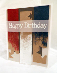
So easy!! Rubbing VersaMark Ink down a strip of kraft paper
then heat set with embossing powders. 

Sending this to Crafty Gals Corner and yes, again, CAS(E) this Sketch.. Why can't I get enough of the CAS(E) this Sketch challenge. Seriously! This sketch has me in a tizzy! So diverse and so impactful! This outstanding color challenge using a patriotic theme came from Crafty Gals Corner.

Sending card to:
Crafty Gals Corner: #24 - Theme Red, White, and Blue
CAS(E) this Sketch: CTS #128


This card was so easy to make.. Most of you probably know I made this but for those who don't here we go!

How to:

  1. Cut and scored my white card base to A2 size.
  2. Cut gray-brown panel a bit smaller then the base. Added panel to card base.
  3. Added a dark brown rectangle to the top of the panel.
  4. Cut my strips of kraft paper.
  5. Rubbed VersaMark Ink down the strip leaving room on the bottom.
  6. Added red, white, and pearlescent blue embossing powder to the panels.
  7. Removed some of the powder on the bottom to get a rougher look then heat set.
  8. Die cut stars on the strips of embossed panels.
  9. Added the panels to the card base.
  10. Stamped sentiment on vellum with VersaMark Ink and heat set with white then added the vellum strip to the card.
So now I am really going to bed!! See you soon and don't forget to leave a comment good, great, or otherwise! Take care all and thanks again for helping me make it to my 100th post!!

All the Best,
Shawna 


Ballroom dancing

I remember when I was a child my dad and I would pass a roller rink on our way home. I always thought this dilapidated building was a dance studio. I would always tell my dad I wanted to learn how to ballroom dance like he did when he was a boy. Well I never did get those dance lessons but what I did get was a dance in the kitchen every now and then. He would whisk me across the kitchen floor leading every step while humming a tune. He was such a well trained and wonderful lead.

Oh memories...You will know why I am talking about this after you see my card for tonight.

I decided not to adhere the color panels completely
down leaving them to 'float' on the card base. Wanted to resemble draperies.
The vellum softens the rather bold lines.
Fussy cutting the bottom of the chandelier letting the dark blue
spill into the pink gives the design some pzazz.

Entering Challenge:
ColourQ: cQc #295
Addicted to Stamps and More: 3rd Birthday Celebration 

    As you can see I am sending this creation to ColourQ Challenge and Addicted to Stamps and More. As I was creating I thought this card reminded me of a ballroom with a gold chandelier and elegant draperies all trimmed up to celebrate!
GRAB OUR BADGE!
Addicted to Stamps and More:
#149 - 3rd Birthday!

Color challenge from
ColourQ
How to:
  • Cut and scored my card base to size A2.
  • Stamped my chandelier using VersaMark Ink and heat set with gold embossing powder. 
  • Fussy cut around the bottom of the chandelier; then die cut the arch.
  • Die cut vellum, white and pink CS at the same angle and layered.
  • Adhered the panel to my card base. 
  • Stamped the sentiment.
  • Added some gold dots for some sparkle.
This card took me by surprise... It is nothing like I imagined in my minds-eye. However, as usual, the final result turned out better.  I had so much fun playing with the layers of solid colors with a touch of patterned vellum.. The color combo is just spectacular! 

Thank you for stopping by!! I am off to bed and will probably dream of a wonderful ballroom experience! And remember leaving comments are always appreciated. Take care and have a great night!!

All the best,
Shawna

Sunday, June 21, 2015

Cherish

This card comes from three challenge blogs. They are CAS(E) this Sketch, The Card Concept, and Naughty or Nice Challenge.  All three were so inspiring my head was spinning with ideas!! Kind of an overload...

Sending my card to:
The Card Concept #37 - The Butterfly Effect
CAS(E) this Sketch: CTS #128
Naughty or Nice Challenge: NON16


And here is my card.. Wow! was this fun to make.. A bit involved but well worth it!
The design elements are from the challenges which made for a
wonderful card.
Watercolor background was done using leftover
Distress Ink from a previous project. All I did was mop the ink up with paper
then let it dry for a year or so.
The understated sentiment embossed on vellum in silver
is an elegant touch.
Like I said earlier this card was so fun to make.. What I really like is it is exactly what envisioned in my minds-eye. This happens to be very, very rare I always seem to improvise. The panels are another element that have added interest with its angles at the bottom of the card. And lets talk about that larger-then-life butterfly which proves to be a pretty dominate focal point of the card but at the same time I feel it doesn't distract from the rest of the card.

How to (Reader's Digest style):
  1. The watercolor panels were made about a year ago. It is leftover ink from a previous project. All I did was mop it up with this paper.
  2. Cut it into three sections and applied it to the card.
  3. Cut the angles at the bottom of the banners.
  4. The larger-then-life butterfly was stamped with VersaMark Ink and then heat set in white. 
  5. Applied Distress Inks to the butterfly and wiped of access so the white embossing powder would resist the color. 
  6. Fussy cut the butterfly. 
  7. Divided the butterfly into three pieces and adhered each section to a watercolor panel. 
  8. Cut a strip of vellum then embossed the sentiment in silver and added a silver dot.
This took a lot of measuring, which it something I am not a fan of doing. I am also surprised that I didn't pass out from holding my breath most the time hoping all will work out. And thank goodness it did turn out. And I think the end result is beautiful. 

I hope you enjoyed your stay! Please if you would like leave a comment good, great, or otherwise that would be great!! Take care all and Happy Fathers Day to our guys out there!!

All the best,
Shawna

Watercolor with Flowers

Hello Again,

I said one more post for the night so here I am. Tonight I am playing along with CAS(E) this Sketch!. I really like this blog because the sketches are always fresh and full of potential. Plus, it is so much fun to see how others were inspired by the sketch.
Sending my card to:
CAS(E) this Sketch! Challenge #128
Oh how I adore three's!! It is so pleasing and makes me smile. So when I saw this challenge I was 100% in; but what to do.. After some soul searching I decided on this design.. So without further ado here is my card.
I have wanted to use this stamp but never got around to it
until tonight!! The colors of the panels are so pretty.
The sentiment is backed with vellum. It just makes it
pop a little bit without stealing the show.
I hate to waste craft supplies. We all know all too well how much this obsession (I mean) hobby costs. So to clean up distress ink and water with a paper towel just to throw it away was unexceptionable to me! So I mopped it up with watercolor paper. And then let dry for..... well.... probably a year.  It was just hanging around waiting for the right project to come around. And here we are. The flowers are a perfect addition to this already dynamic design. The spotlighting gives the background some interest. Plus I really the technique I have used it numerous times. The poppies were heat embossed in brown then colored in using my PrismaColor pencils.. This card turned well and I'm pleased with the outcome. It is a very calming card with texture and visual interest. Perfect for that someone who is soft spoken.

Well that is it for me I hope you enjoyed your stay.. Take care and don't forget to leave a comment good, great, or otherwise.. Thank you again!

All the best,
Shawna 

Happy 'flip flopping' Mothers Day

Okay, I know it seems like I am being a horrible daughter; but wait!! Tonight I am playing along with Little Tangles and Curtain Call and I promise the title of this post will make much more sense.


The challenges I am entering:
Little Tangles: Challenge #57 - sketch
Curtain Call: Theme - Flip Flops

See not so bad!! And here is my card...

This is the final product. The upper left of the card you
will see the CS is actually shimmery blue.
Perfect poem for Mothers Day.
Dry embossing the top with my Swiss Dots folder.
brings both the inside and outside together.
This is the card without the sentiment
just waiting for the right recipient. 
This card actually surprised me how well it turned out.. The watercolor panel is extra from another project and the flip-flops are rub-on images from my discount craft store. You can't really see it, but all the shoes are framed in a sketchy box heat embossed in white. The Swiss Dots embossing folder added a bit of texture to the design. Plus, the pattern matches the shoes patterns. The yellow border around the watercolor panel is very subtle but important. It brings out the yellow in the panel and also contrasts nicely with the crisp blue. These colors are all Summer! And like I have always said 'It is not Summer without flip-flops'.  

One more post for the night and I'm out! Thank you so much for stopping by!! I really do appreciate it. And if you feel so moved please feel free to leave me a comment. Take care and have a great night!

All the Best,
Shawna

Friday, June 19, 2015

Forgotten Birthday

Hello Everyone,

For someone who makes cards almost constantly you would think I would remember everyone's birthday.  Well you would be sorely wrong.. I seems sometimes I need to make more of these 'sorry I forgot your birthday' cards then birthday cards.. But it is the thought that counts. Right? Okay, not really..

I am sending this card to Make My Monday challenge. Their challenge was to use embossing- heat or dry.  So I decided to do something a bit different which I will explain later. Also I see that you are looking for a design team member and yes I would be delighted to fill one the four spots available.

To Find Our Current Challenge
Entering Make My Monday Challenge
Embossing - heat or dry
Well here we go! My card for today... It is a bit different but I think you will like it.
This sentiment is a bit snarky but I think it is
very clever for a belated birthday card.
The texture from the stencil gives the anchor an aged and weathered look.
Like it has been at sea for awhile.
After I the anchor was dry and the embossing powder
was heat set I went in and colored the inside of the anchor
bronze which give it the look of metal. 
I had this idea for the Fusion Challenge: Blue Skies and smooth sailing AND this challenge but I just couldn't get to Fusion on time. Bummer. Anyway, this card was so out of my comfort zone but when I saw this video from Jennifer McGuire Ink I just had to try.. It seemed easy to do and the impact I thought would be incredible... And as you can see I was right. This anchor is full of texture, dimension, and the metallic color is just divine!

Okay so this is how I did it.
  1. Stamped the wood grain stamp with bleach on teal CS. Washed stamp ASAP
  2. Cut teal CS bit smaller then A2 size
  3. Mixed texture paste with gold and brown acrylic paint.
  4. Placed my stencil and applied texture paste over the design. Pulled it up and added brown embossing powder over the majority of the paste
  5. Let it dry. (about an hour).
  6. After drying, I heat set the embossing powder.
  7. Colored the inside of the anchor using a PrismaColor pencil color: metallic bronze. 
  8. Die cut circle then set aside.
  9. Created card base A2 size out of kraft paper
  10. Stamped the rope image, cut, and fit to the design.
  11. Applied the anchor panel on the kraft card base. 
  12. Distressed the card base and the edges of the anchor panel
  13. Stamped sentiment.
I hope you like what I have created. Please leave any comments you may have good great or otherwise... Time to get my day started.. Take care.

All the best,
Shawna

Thursday, June 18, 2015

Behind every Layer is a Card

Hello All

For today I am playing along with Just Us Girls card challenge. The theme for this week are stacked die cuts.. Well no-problemo!

Entering: Just Us Girls
Trend Week #297
Stacked Die cuts
'Oh hello U.' I really like the way this turned out.. The layers are cohesive because of the color pallet. The same color weave through each layer making your eye skip around. However, the white border keeps your eye in check not to wander off.  The angled panels create more interest with the black border. The sentiment was die cut and was the umbrella.. I thought it needed a bit more pop so I added a black shadow umbrella underneath. The hexagon shapes were done with heat embossing a hexagon stamped image with white powder. then I wet the surface and added watercolor and let the color bleed through. Some flowers were added with some tiny rhinestones for some sparkle.

This lively sentiment seems to match the mood of this
die cut stacked card.
This card is full of dimension, color, texture and pattern
It all seems to go together due to the consistent color pallet. 
Showing the flower detail and that little bit of sparkle.
You can also notice the water color bleeding through the embossed images.
I think this card is way fun with all its color, texture and pattern. It would be perfect for the someone you haven't contacted in awhile... Ummm... Maybe my sister who has just recently moved to Rochester, New York.

Well once again this concludes another entry for TheGrandStampede! I hope your day is well and we will see you all sooner then later!!

All the best,
Shawna

Monday, June 15, 2015

Bright, Vivid and True

Hello All,

The title of this post comes from one of my favorite children books of all time. It is one of those books that is off the popular book radar but what a gem of a story! It's titled 'The Color of Things' by Vivian Shalom.  I have quoted her quite frequently but never made reference. Now I wanted to give credit where credit is due. If you have small children I highly suggest this book!  A wonderful imaginative story filled with all things good; and a keeper for my grandchildren.

So now for tonight's challenge. I am going to submit my card to CAS(E) this sketch. When I saw this sketch I knew I had just the design I wanted to use.

Submitting Card to:
CAS(E) this Sketch- CTS #127
And here is my card! I hope you enjoy it..

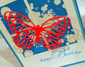
These color work so well together. I am also
really enjoying the sea-foam green matting. It makes
the card kind of glow.
The orange butterfly is just delightful.
Perfect for a birthday card.
This butterfly is so intricate in detail that it allows
the design below to be shown and become part of the card. 
I think this card is so striking with its complementary colors of blue and orange. The white also acts a color as well letting every other color pop so vividly and true. The splotches are also a beautiful touch and allows for movement around the card. But lets not be mistaken, the butterfly is the focal point and it must steal the show..

How to:

  1. Cut and scored my CS base to 4.25" x 5.5" (A2)
  2. Cut two more mats a bit smaller then the base then attached it to the card.
  3. Cut a square out of CS then slightly distressed the edges for more depth.
  4. Stamped the grunge splatters randomly throughout using VersaMark Ink then heat set using white embossing powder.
  5. Cut the square into quarters and attached it to the base.
  6. Die cut the butterfly and added it to the card.
  7. Stamped sentiment using the same color ink I used to distress the edges.
Easy-peasy!! Didn't take any time at all yet the effect is stunning and simple in its design. 

So for tonight I am done.. Busy day today and tomorrow even busier but I wanted to carve out time for my obsession (I mean passion- hehe). 

Thank you for stopping by and please if you feel so inclined to leave a comment good, great, or otherwise that would be awesome! Take care everyone and see you soon!

All the best,
Shawna 


Spectrum of Color

Hello Again!

For today I am sending my card to Hand Stamped Sentiments.  This happens to be one of my favorite color combos! I had to play along!! I didn't have Crushed Curry or Mossy Meadow so I did my best to match them up with what I had in my arsenal.
Entering my card to:
Hand Stamped Sentiments #213
And here it is!!  I hope you like it..

I thought the bird was the perfect touch
for this card all perched up saying 'thank you'.
I have seen these alternating rectangles before
and just like the balance. The black circle adds a place
for your eye to rest.
This card just spontaneously came into existence. I wasn't sure how it was going to turn out but I knew I had to use these colors. So I just started with that idea and went forward.

How to:
  1. First I got out my Bermuda Bay and Calypso Coral Blendabilities; and my Mexpy alcohol markers to match the Crushed Curry and the Mossy Meadow. Then I just started applying color using large strokes in rainbow order (R.O.Y.G.B.I.V.). 
  2. Cut it into quarters and rotated the images then matted them on white CS.
  3. Randomly stamped  the leaves (SU: French Foliage- retired) to create movement and interest. Plus rainbows look fantastic with black and white. 
  4. Die cut a circle a bit offset for interest. 
  5. Traced the circle from the die cut panel to black CS. This gave me a guide to stamp the bird/sentiment. 
  6. Added a white strip of paper to anchor the bird and I think it adds just a bit of interest to the entire design.  
  7. Erased the traced circle and adhered the rainbow panel to the black CS. 
  8. Lastly, I added the entire panel to my card base. 
Well I hope you enjoyed your stay! If you feel so inclined to leave a comment it would be greatly appreciated. Take care and we will see you soon!!

All the best,
Shawna

Sunday, June 14, 2015

All American Birthday

Hello Everyone,

Addicted to Stamps current challenge theme is 'holiday'. We could choose any holiday, so I chose the 4th of July. One of my family members has a birthday on the fourth so why not make his card early and play along with Addicted to Stamps challenge blog.

GRAB OUR BADGE!
Entering Challenge:
 
Addicted to Stamps: Challenge
#148- Holiday

This is a sketch I saved from
The Verve Sketches Blog: May 2014


So last night off I was to make a card from the The Verve Sketches Blog. It is a sketch that inspired me back in 2014 so I kept it until I thought it would be useful. Well now was the time!


And here is my card!!  Wanted the idea to be birthday and patriotic working together as one design. If they were competing with each other the card would make absolutely no sense. I think in this case I did a good job of fusing the two themes together. Well enough chit-chat here we are!! I just love the way it turned out!!

This card really is All American! It also nicely
doubles as a birthday card.

Texture and patterns all are working together
to form this cohesive design.
The blue twine and embellishments were
made to resemble fireworks.
The sketch has always reminded me of the 4th of July (U.S.A. Independence Day). It is probably because of the stars.. I decided to use the 'star' theme throughout my card but I don't think it is too overdone.

How to:

  1. Cut and scored my CS base to 4.25" x 5.5" (A2)
  2. Cut an A2 size sheet of patterned star paper and attached it to the card.
  3. Dry embossed a red strip of scrap then distressed it using Espresso Truffle Ink by Memento. Attached it to the card.
  4. Cut a blue banner to fit then distressed the edges using the same ink. Attached to the card.
  5. Cut striped paper to size and rounded the corners.
  6. Die cut three stars then scored lines in the stars for dimension. Dry fit.
  7. Created tag and distressed the edges with the same Memento Ink.
  8. Added dark blue twine and adhered it to the banner then added 3 pearl-like embellishments.
  9. Stamped sentiment.
  10. Assembled the entire card.
I want to thank you so much for joining me today. I hope you enjoyed yourself and we will see you very soon.  And please if you'd like please leave a comment good, great, or otherwise. Take care all and thanks again.

All the Best,
Shawna


Friday, June 12, 2015

Shiny Happy Mermaid

Good evening (or morning),

Here I am again with another card.  I have had this card sitting on my desk for two days and I need to send it out. That is why I am posting for a second time in less then 24 hours.

So here we go! For tonight I am entering The Challenge by Always Playing with Paper and you can probably tell by the title what the focal image of this project will be....

Linking up with
The Challenge #38

Yup. A mermaid.. I have had this stamp forever and always meant to use it and never did.. 'Later' I would tell myself.. Well here we are!

I hope you like what I created. Hopefully I didn't break any challenge rules by using another lighter blue...

Light streaming through the water from above making sure to
fade out the color as I went down the panel.
The black 'bubbles' acts to frame the sentiment without
overshadowing the focal image.
I created this card for my niece. It is her 8th birthday in a few days and I am sure she is going to love this card! My 9 year old daughter wants it so I am positive it will be a hit.

How to:

  1. Cut and scored my kraft paper base to 4.25" x 5.5" (A2)
  2. Cropped another kraft panel to 1/4" smaller then the base.
  3. Stamped the mermaid then created a mask and placed it on top of the original mermaid.
  4. Sponged my smaller kraft panel using Paris Dusk Memento ink making sure to fade out the color on the top of the panel.
  5. Removed mask and colored the mermaid and its scene using PrismaColor pencils as per the color challenge.
  6. Re-stamped the mermaid and heat set using black embossing powder.
  7. Shaded the top of the ocean with an almost white, light blue pencil to create streams of light fading out as I went down the panel.
  8. Rounded the corners of the panel
  9. Die cut the panel and adhered the kraft panel to the kraft card base
  10. Added three black die cut bubbles.
  11. Stamped the sentiment
  12. Outlined the ocean scene with a black Sharpie.
Wow! I am going to have to sign off for now and get my beauty sleep (Okay just sleep, no beauty involved).. Thank you for stopping by and hope to see you soon! Don't forget to leave a comment good, great or otherwise. 

All the best,
Shawna