Accolades

Friday, July 31, 2015

Hello You!

Hello all!

I promise this is my last post of the night.. I apoloize for this bombardment but I just wanted to get this challenge in for Cupcake Inspirations Challenge. I have found this color combination to be very inspiring. The bold black and white mixed in with a gold color could make for a very rich crisp design. Well here we go! I hope you like it.

Very bold stripes contrast nicely with
the golden circles.
Framed the flowers using golden yellow CS.
I believe this separates the two strikingly different elements
Simple sentiment with the bold design.
Using my new stitched circle die.
This card really turned out fantastically wonderful.. I love the movement of the stripes, the bursts of black on the patterned panel, right down to the simple sentiment. The golden panel is supposed to off center to counteract the funky lines behind. But I feel it all balances out with the stitched circle sentiment.

Entering Challenge:
Cupcake Inspirations Challenge 320
I will be linking this card to Mynn Kitchen's Blog. She is my talented team-mate from House of Cards and is celebrating 5 years of blogging!! She also has a give-away with some fantastic prizes.  Hop over to her blog, On a Stampage and have a looksy.

How to:
  1. Cut and scored white CS base to an A2 size card. Set aside.
  2. Cut a panel slightly smaller then the base and stamped the stripes.
  3. Outlined the panel with a black marker.
  4. Stamped the circle panel and colored portions of the panel golden yellow.
  5. Repeated step 3.
  6. For separation a yellow mat was added off center from the card.
  7.  Repeated step 3.
  8. Die cut a stitched circle then stamped the sentiment.
  9. Adhered sentiment circle using dimensional adhesive.
I believe this card is very impactful and ready to cheer up anyone's day! It is time for me to 'hit the hay'; it is very late here. However, I would like to thank you again for joining me this evening.. I really appreciate you taking time out of your busy day to visit me. Take care and don't forget to leave a comment if you are so inclined. Thanks again everyone and we will see you soon.

All the best,
Shawna 

Thursday, July 30, 2015

Fabulous Chevron

Hello Readers,

For today I am posting a CAS card. This style of designing seems so easy and simple but for me it is one of the hardest cards to design. Lots of white space with minimal distractions is the hallmark of CAS. So for me keeping things Clean And Simple can be a challenge but I think I did the job of CAS on this card. I hope I achieved it but I will let you be the judge. Here is my card for Addicted to CAS. Enjoy! I hope you like it.


The chevron border at the bottom of the card acts to anchor the bottle giving it a sense of place. The black chevron and sentiment color keeps balance throughout the design. The bottle image is stamped with color but not too much to distract from the bold chevron. This design is simple but very effective!

I got this sentiment stamp at my local outlet store which sells damaged goods at bargain prices. I just love the font, message, and scale of the sentiment. And needless to say it was mine in a heartbeat!
Entering Addicted to CAS
Codeword: Chevron
How to:

  1. Cut and scored my white CS to an A2 card size.
  2. Punched out two strips of black chevron and added to the base.
  3. Stamped the bottle image selectively inking the stamp with the colors shown.
  4. Stamped the sentiment.
That is it for me right now.. I have a few more challenges to enter but first I must make dinner for my family.. Taco night.. Yum! Take care and thank you so much for stopping by and please leave a comment if you'd like. See you sooner then later.

All the best,
Shawna 

Cheers!

Hello Readers,

For today I am going to play along with Inkspirational challenge with a color challenge 'anything goes with kraft'. This card has been in my sketch book for several months but never came to fruition until this challenge. I hope you enjoy it as much as I liked making it..

Snippets of the drinks through the windows
 and dots around the windows
has a festive feeling. 
Gold and white cord adds a lot
of texture to the card..
Detail of the die-cut sentiment and
coordinating stamped image.
This card is full of color, texture, and dimension that is sure to please any adult recipient! The sentiment is this and delicate but because of its color it stands from the gold cord and kraft paper. The dots create a festive feeling thoughout the design while the cording moves your eye all around the card. To add a bit more dimension and to compensate for the thickness of the cording some dimensional tape was added.

Sending this to Inkspirational
Challenge #87: Kraft
  How to:

  1. Cut and scored my white CS to an A2 size card base.
  2. Cut kraft paper smaller then card base and rounded all the corners.
  3. Die cut the circles on the kraft paper as shown
  4. Dry fit the kraft paper on the card base and lightly traced the die cut circles.
  5. Wrapped the gold and white cording around the die cut circles and edges of the kraft paper. Set aside.
  6. Stamped the glasses using the traced circles as a guide erasing the guidelines when finished.
  7. Adhered the kraft panel to the card base.
  8. Punched/die cut circles; 3 with color and the rest white then adhering them to the kraft base.
  9. Stamped the 'happy birthday' sentiment with black ink on the kraft paper.
  10. Die cut the 'cheers' sentiment and added it to the card.
I hope you enjoyed your stay and thank you so much for stopping by. Don't forget to leave a comment good, great, or otherwise! Take care all!

All the best,
Shawna

Bokeh Universe

Hello Y'all!

My sister-in-law, who is from South Carolina, just left today after a week's visit. What a great time for reuniting with family it is always such a joy.. With that said, I was neglecting my craft 'table'... It needed to be cleaned and used again.

So off I went to clean and create and this is what I came up with for CAS(E) this sketch and colors inspired by ColourQ. As some of you might know I am a space geek. While crafting for another challenge I was listening to a space program when I looked up I saw the image of the sun and some bokeh diffused around the star.. Well that was all the inspiration I needed to come up this card.

Bokeh space image using chalk ink and stencil.
The sentiment seems to correspond nicely with the bokeh.
The ColourQ colors are very
muted and subtle against the dark background that 
showcases the sentiment. 
Challenge entered:

I think this is the fastest card I have ever done.. It came together so quickly and easily and I couldn't believe my eyes on how well it turned out!

How to:
  1. Cut and scored my white CS to an A2 card size. Set aside.
  2. Cut black CS to 4" x 5.25" 
  3. Stenciled circle images by sponging chalk inks and frosted white directly to the black CS.
  4. Stamped sentiment using VersaMark Ink then heat set in white.
  5. Mounted the black CS panel to card base.
That was it... In total I think it took twenty-thirty minutes from start to finish. I have been realizing that if I have a plan before working on a design it will go a lot faster then if I didn't. 

Well my eyes are getting heavy and they want to go to bed.. Thank you so much for stopping by I really do appreciate it. Also, if you feel so inclined to leave a comment that would be great too. Take care all and see you next time on TheGrandStampede!

All the best,
Shawna

Friday, July 24, 2015

Fairy in Watercolor

Hello everyone,

For today I have a card that is bursting with color, whimsy, and maybe a little bit of magic. Here is my card for today featuring this amazing fairy image! I usually wouldn't post so many photos but I wanted to show all her detail and color. I hope you enjoy it..
Fairy is center stage and colored using watercolor
pencils then blending it out with an aqua pen.
The vellum softens the background to let our
fairy pop off the card. Plus, the vellum also serves as
another layer for the flourish and sentiment.
Our fairy is sitting on a silver embossed flourish.
This gives her a sense of place.
The watercolor pencils and the aqua pen seem to be
the perfect tools for the job.
Sentiment stamped on vellum is bold but
doesn't overwhelm the focal point nor it gets lost
into the background.
After painstakingly fussy cutting around her I felt she needed
more dimension so I popped her up with some dimensional adhesive.
 It also is the start of another challenge from the Brown Sugar Challenge Blog with the theme 'Anything Goes'! 

Grab Our Badge

This magical fairy image came from our sponsor 'Crafty Sentiments'. Stop on over and see their huge selection of super cute images!
  

Isn't she just fantastic! This fairy needed to take center stage for this design. She is  gently sitting on a silver flourish which was stamped and embossed on a piece vellum. The vellum acts to soften the the vibrant background but it also gives it a dreamy mystical quality that suits our fairy very well. The vellum also allows the fairy to become the dominate figure; otherwise she would visually disappear into the backdrop.

When I got the idea for this card I knew the exact sentiment I was going to use; 'Some things have to be believed to be seen'.  My nine year old daughter completely agreed with that sentiment saying: 'Mom, kids see fairies all the time because we believe they are there.'... Well I guess that answers that question and she is right! Adults are so jaded and our silly 'important' experiences get in the way of the magic of life.

How to:
  1. Stenciled the background using teal, hot pink, yellow then traced each element with a gel pen. (this was actually for The Paper Players challenge but it didn't sit right with me, so I set it aside and thought it would be perfect for this card!)
  2. Printed the fairy image on watercolor paper. (had to print on lower gauge paper due to the printer feed)
  3. Colored the fairy using PrismaColor and Faber Castell watercolor pencils. 
  4. Fussy cut (without swearing) around the fairy image. set aside
  5. Cut vellum panel to cover the stenciled base.
  6. Stamped flourish with VersaMark Ink and heat set using Rangers 'silver' embossing powder.. FANTASTIC results!!
  7. Added dimensional tape to the fairy and adhered it to the vellum.
  8. Stamped sentiment
  9. Placed the vellum panel on the stenciled panel.
  10. Added the design to an A2 CS card base.
Well I hope you enjoyed your stay! I really do appreciate taking time out of your busy day to visit TheGrandStampede.  Take care and we will see in a couple of days!! All comments good or otherwise are always appreciated. So please, don't be shy!

All the best,
Shawna

Tuesday, July 21, 2015

Too Much Happy?

Hello all!

The card sentiment for today is, in my opinion, a loaded statement and most likely a great conversation starter! 'You can never have too much happy', I will get into why later on but first I wanted to show you my latest and greatest card creation. Here it is I really hope you like it.

Color palette looks amazing surrounded by all this white.
The color keeps your eye moving till it lands comfortably on
the sentiment.
A side folding card is just a bit different for this
modern CAS design.
So, can you have too much happy?
I am not sure.. Why?
 Well without sadness how can appreciate happy. 
I am playing along with three challenges today. The Paper Players is to use 'frames' and keeping the design clean and simple (CAS). My interpretation of frames was outlining some of the hexagons with colors inspired by Create with Connie and Mary challenge. The shadows from the cover plate can also be considered frames. While we are on the subject of CAS, the folks at Addicted to Stamps are making CAS their theme for this week. 

Sending my card to:

    CCMC364   GRAB OUR BADGE!

The color combination is just fantastic for this predominately white card.. It seems that the eye is drawn all over the card from the pops of color that surround it. The outlined black hexagons brings you back to the solid black hexagon and sentiment which is framed by a larger vellum hexagon. Very subtle but very effective. 

How to:
  1. Cut and scored my CS to 5.5"x 4.25" (A2)
  2. Die cut a hexagon cover plate and attached it to the card base.
  3. Coloring/outlining select hexagons using the challenge color palette.
  4. Stamped sentiment using VersaMark Ink then heat embossed white on black CS and die cut.
  5. Die cut a larger vellum hex frame then adhered it behind the sentiment hex.
  6. Attached the hexes to the card base.
Easy as that! Well not really, I went through many design options before getting to this one and I am very pleased with the outcome.

Thank you so much for stopping by I really do appreciate your visits! If you'd like, please leave a comment good, great or otherwise! I enjoy reading what you have to say. Take care and we will see you sooner then later.

All the best,
Shawna 

Monday, July 20, 2015

Pretty in Purple'ish

Hello all!

I will be forty pretty soon and was given such a pretty ring for my birthday. To thank her I wanted to make the best thank you card.. Wow! Does this card fits the bill perfectly. She loves anything pink, purple and sparkly.

The translucent flower draws some of the color
from underneath giving it a kind of glow..
Very elegant thank you card. The border
has a velvet touch.
'you' is offset from the darker purple
showing a bit of dimension.
I usually wouldn't do such a vividly purple card but this color challenge from Color Throwdown just took me by surprise.. Upon opening up the blog I said that I had to do this! It took a few tries but in the end I think I got it.. 

Entering Color Throwdown #351
How to:
  1. Cut and scored white CS to A2 size
  2. Die cut the pink panel then distressed in purple.
  3. Die cut vellum flower then folded the petals to show dimension. Added purple circle and sequin to the center. Set aside.
  4. Die cut dark purple flourish then added it to the pink panel.
  5. Added purple velvet border to the pink panel and a thicker strip to the dark purple border.
  6. Added white string then adhered flower to the pink panel.
  7. Adhered the pink panel to the dark purple panel.
  8. Attached the purple panel to the velvet panel.
Well that is it for me today.. I hope you liked your stay and want to thank you for stopping by.  Don't forget to leave a comment good, great or otherwise.. I like to hear what you are thinking. Until next time take care and we will see you soon.

All the best,
Shawna 

Thursday, July 16, 2015

Happy Cupcake

Hello All,

For today I am playing along with Curtain Call and Just Us Girls.. These challenges are what created this fun and cheery card.... However these challenges were well.... Challenging. At first I thought I had it in the bag! Then I got to my craft table and....... Crickets. I went through idea after idea then I thought 'go with what you know.' and I did.. Then after some time fiddling this card started to evolve into something that is really like.. In fact, it has become one of my favorites..

The subtle gradation from dark pink to almost white gives a kind of glow to the design.. The other colors can be seen through the luxurious gold embossing. The cupcake gives the card a sense of whimsy as does the sentiment. That was the method to my madness I hope you like this card as much as I liked making it..

The background stamp works perfectly with
the ombre background. Each of the elements
fading away as they go to the top of the card.
The gold embossing gives the card texture and shine
that I think is so fun for this playful birthday card!
The cupcake and sentiment have center stage
and is not fighting with the dynamic background

Challenges I am entering:
    Curtain Call- July 1~Celebrate
    Just Us Girls- Trend Week~gold


How to:
  1. Cut and scored my white top folding CS base to 4.25" x 5.5" (A2) set aside
  2. Cut another sheet of CS to appox 3.5" x 5".
  3. Sponged yellow, teal, dark pink, and light pink onto the smaller CS creating an ombre effect. 
  4. Let it REALLY dry. (hint: try sprinkling embossing powder on the inked surface first to make sure that it is dry).
  5. Stamped the image with VersaMark Ink and heat set it with gold embossing 'powder'. (hint: take a swiffer duster and wipe off the excess glitter embossing powder from your work surface. Works like a charm).
  6. Stamped the cupcake image twice and used the second stamped image to color and the first image for the cupcake wrapping.
  7. Fussy cut the cupcake and the wrapping.
  8. Stamped, colored, and fussy cut the cherry on top.
  9. Adhered the assembled cupcake to CS and fussy cut around the image for a white border.
  10. Die cut the sentiment 'happy' twice. The second sentiment die cut only the 'hap' then stacked two of them on top of one another to match the cupcake image. 
  11. Assembled the card as shown on the white CS base.
I want to thank you for your patience getting this post together. I was yet again on another time crunch to get the card linked in but I wanted to really take time to write out my explanation and intention for the design and how to recreate it if you'd like.. 

Thank you for stopping by leave a message if you so inclined to do so. Take care and we will see you soon at TheGrandStampede!

All the best,
Shawna

Tuesday, July 14, 2015

Circular Madness

Hello again Everyone!

I wanted to send this card to the Create with Connie and Mary and Colour Q challenges. Both were fabulous challenges which inspired my creation.. Here it is I hope you enjoy it!


Entering Challenges:
Create with Connie and Mary: Sketch Challenge #CCMC263
ColourQ: Challenge #298

CCMC363    

The circles within the circle are each colored using the Colour Q challenge and the layout was inspired by Connie and Mary. So cute and more importantly so easy.. It is just one layer and is ready to be popped in the mail at a moments notice. I am sure-ish this card may be CAS design. Please correct me if I am wrong.

I think the pops of color really makes this card stand out. The subtle yet cheery colors are just perfect for the sentiment that was stamped. I thought at first I would color in the letters but then looking at it again I thought it looks great just the way it was.

So this is how I made this delightful card.
How to:
  1. Stamp the circles from the retired Circle Circus set 
  2. Colored one circle in each of the larger circle one color that was taken from the ColourQ challenge. 
  3. Rounded the corner of the card
  4. Stamped the sentiment 
I am not kidding that is all it took to create this card and what a an impactful and graphic design this ended up becoming. I am really enjoying how this card turned out and I hope you do to..

Well that is it for me tonight I am (once again) cutting it close with entering a challenge but I think I can make it.. Take care and please leave a comment and let me know what you think! Until next time..

All the best,
Shawna

Monday, July 13, 2015

Rainy Days

Hello Readers,

Wow this challenge for CAS-ology was submitted right under the wire... Phew! Well now I have some time to explain in my normal fashion how and what inspired this design.

Today is very dreary and wet so this came naturally for today's card that was inspired by CAS-ology challenge blog. I am also submitting this card to Just Us Girls and the Color Throwdown with their delightful color schemes they have provided. 

Like I mentioned above, submitting this card was a close one for CAS-ology! I had only seven minutes left to link-up. And I swear I know my computer feels that I am in a rush because it runs extraordinarily slow! Seriously!! Oh well got it submitted all is happy at TheGrandStampede!  However I don't want to ignore the Color Throwdown and Just Us Girls where I have a bit more time to submit this.
Combining texture without color still gives the sense
of white space.
Detail: Showing the texture of the rain and umbrella.
And these are blogs are I am playing along with.. I have had this design in my head all week why I didn't just do it and submit it well... There are some days this is my motto: Don't rush me can't you see I'm waiting till the last minute..

Playing along with
CAS-ology Cue: Repeat
Playing along with:
Color Throwdown: ctd350
Playing along with:
Just Us Girls: Trend Week #301
I don't think I have ever made a card in such record time! So let me tell you quickly how this was done..

How to: 
  1. Cut and scored white 110lb. CS to A2 size
  2. Placed a rain stencil down then layered embossing paste over the stencil.
  3. For the sake of time it was dried using a heat gun.
  4. Die cut 4 gold umbrellas and 4 colored canopies using the colors from the challenge.
  5. Adhered canopies to the gold umbrellas and place them on the card base.
  6. Stamped sentiment.
Well now I am going to collaspe on heap on the floor and sleep... No not really, I have to get my kids their lunch.. Thank you for stopping by and if you'd like I would love it if you leave a comment. Take care and see you soon. 

All the best,
Shawna 

Sunday, July 12, 2015

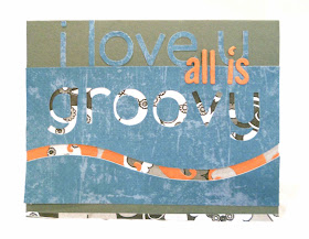
All is Groovy

Hello All,

For today's card I will be joining The Male Room. Their theme for this fortnightly challenge is to use a song title or (I believe) a lyric. So this is a wonderful challenge because I just have some song titles/lyrics at my craft table just waiting for such an occasion as this challenge! My song title/lyric comes from 'The 59th Street Bridge Song (feelin' groovy)' from Simon and Garfunkel. One of my favorites! If you are unfamiliar with the duo click here for some more info.

This is the album cover from their 
Greatest Hits album in 1972

While you enjoy the music I would also like you to have a look at my card I made for The Male Room- Theme: Song Title (TMR#14-15). So sit back, turn up the volume on your device, and delight in the music.

The word 'groovy' looks fitting due to the center of the 'o' and 'g'
being offset from the middle. Gives it a more 60's feel.
The paisley background was actually an image I colored
then converted to gray-scale for a more masculine feel.

Even though flowers are present, they are made masculine
due to the color palette and the 60's feel of the design.
The rusty orange accent color has a bit of sparkle.
Just enough to make the elements pop.
As I was creating this card the song just kept skipping in my head. I was almost happy that I finished it because I didn't need it in my mental queue anymore. However, I do think it was worth it.

How to: 
  1. Cut and scored dark gray CS to 5.5" x 4.25" and set aside.
  2. Scanned and printed the paisley in gray-scale on computer paper.
  3. Die cut the denim patterned paper with the word 'groovy' and a wave.
  4. Placed the paisley behind 'groovy' leaving room for the wave to show through.
  5. Added another strip of paisley at the bottom of the card.
  6. Die cut the rusty orange paisley and added them over the gray paisley paper under the wave.
  7. Die cut 'i love u' using the denim PP then added them to the top of the gray card.
  8. Adhered the groovy denim panel and wave to the card.
  9. Die cut 'all is' using the orange paisley and placed them as shown.
Well that is all for now. I hope you enjoyed your stay and if you'd like to leave a comment that would be great too.. Thank you for stopping by and take care..

All the best,
Shawna