Accolades

Sunday, March 29, 2015

Spotting Flamingos

Hello Again!
For today I am entering the Gina K. Design weekly challenge with a technique called spotlighting. Click here to see more. This previous post shows a similar approach to spotlighting.

I am also entering Always Playing with Paper challenge #27.  I took a different approach to the sketch; I used the spotlighting for the banners and the coconut drink for the additional image. Just wanted to think outside the box (no pun intended.).

Entering Challenges:
Always Playing with Paper #27
Gina K. Designs weekly Challenge (STV15MON12)- Seeing Spots!


Well here it is.. Very fun and very colorful.. BTW I would love that yummy drink!

The color scheme from Always Playing with Paper
and the spotlight technique from Gina K.Designs make a perfect match
Showing the spotlight technique
Card Size: 4.25" x 5.5"
Tropical drink image seems to anchor the sentiment. 
  So this is how I created it:
  1. Stamped and masked the flamingos and the background palm trees using Gina K. Designs 'Aloha' stamp set
  2. This step got a bit tricky at first. How am I going to exactly duplicate the flamingos I just stamped on my card to another sheet of paper so I could color it? Well after a couple of minutes I thought 'of course', the printer.  So went to my printer and made a copy. 
  3. Now the image is ready to color. I used the color palette from Always Playing with Paper. 
  4. Mounted the colored image onto gray paper and added it to the card.
  5. On a separate sheet of paper stamped the sentiment and coconut drink.
  6. Colored the coconut and fussy cut.
  7. Cut out the sentiment and adhered it to the card.
  8. Then lastly, adhered the coconut drink image under the sentiment.
Well that brings me to the end of this post.. Thank you so much for stopping by and do hope to see you soon!

Take care all,
Shawna 


Saturday, March 28, 2015

Spongy Palms

Hello everyone!
Been MIA my son had pneumonia then I got it and so on and so forth.. So I am quite literally back online with another card project. This one was prompted by Happy Little Stampers March CAS challenge: Sponging.

 
Entering Challenge:

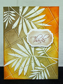
I thought this card would be a wonderful way to celebrate Palm Sunday.  The colors, graphics, and design have all the markers of this holy day. I hope you like it...


This card was ridiculously easy and amazingly pretty! 
Here is how I did it:
  1. Scored the CS at 30 degrees in a grid pattern
  2. Stamped the image then heat embossed in white
  3. Sponged Distressed Inks on CS now showcasing the scored lines. 
  4. Wiped off the embossed leaves with water to clean them off.
  5. Stamped sentiment, die cut the shape and sponged color around the tag.
  6. Used dimensional adhesive and adhered the tag. 
That is it! I hope you have a great day!
All the best,
Shawna 

Tuesday, March 24, 2015

Spotlighting Hydrangeas

Hello all,
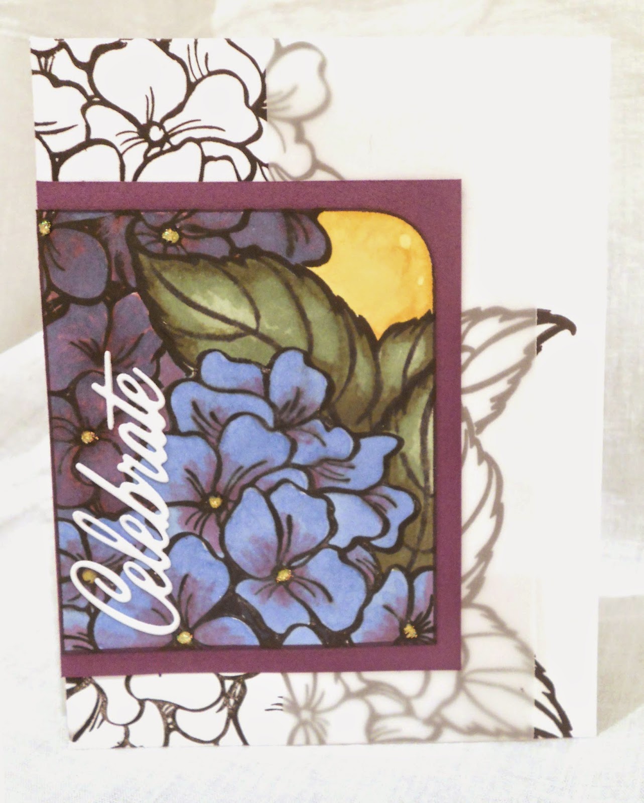
Today I am showing you a card that reminds me Chatham Massachusetts.  Why? Well I visited there a few years ago and FELL IN LOVE with the hydrangeas. The colors are spectacular and vivid like nothing I have ever seen before. To be honest they almost look too good to be real. Especially the ones in Chatham. Well here is my card tonight using the inspiration from Fusion Card Challenge: Floral Fusion.
Entering Challenge
Fusion Card Challenge: Floral Fusion
I hope you like my take on 'fusing' this card... And don't forget to leave a comment. Good, great, or otherwise they are always welcome.

Spotlighting technique. Vellum banner used
not to interfere with the stamped image while
still showing a bit of contrast.
Die Cut 'Celebrate' from Papertrey Ink
is the perfect sentiment for Spring!
Card Size: A2- 4.25" x 5.25"

So here is how I did it.
  1. Cut my card base then white panel
  2. Stamped Jumbo Hydrangea by Stampendous on both the base and panel. Using the masking technique for layering.
  3. Colored the panel using Blendabilities by Stampin' Up! (no longer available). 
  4. Used a tiny drop of Stickles for some sparkle in the middle of the flowers. Set aside to dry.
  5. Added a vellum banner element per the sketch. Chose vellum so not to interfere with the stamped image underneath; yet still adding the texture it needed. 
  6. Die cut the word 'celebrate' spray mounted it and added it to the panel.
  7. Mounted the colored panel on purple CS and adhered to the card.  
And that was it! Really not too hard but the impact wonderful. Well that is all for me tonight take care!!

All the Best,
Shawna


Sunday, March 22, 2015

How enameling dot dot dots!

As you can probably tell from the heading this card is all about enamel dots. Thanks to the inspiration of House of Card March challenge: theme- enamel dots.

Here it is and hope you like it as much as I liked making it.

A bunch of enamel dot embellish this
Spring Gem Stamp from Hero Arts.
The vertical sentiment from Gina K. Designs
is the perfect compliment to this card.
Showing the silver heat embossing just gives the
card a bit of sparkle.
 This is how I did it:

  1. Stamped the Spring Gem stamp in VersaMark ink then used silver embossing powder and heat set it. 
  2. Trimmed the stamped image and framed it with white CS
  3. Added the enamel dots in a variety of colors.
  4. Positioned the sentiment and repeated step one just using the vertical greeting sentiment.
  5. Added three dots vertically under the sentiment for a cohesive design.
  6. Adhered the mounted Spring Gem image to card. 
That is all for now I hope you all have a great night and we will see you again!!

All the best,
Shawna


Thursday, March 19, 2015

Croaky Tuesday

Hello All,
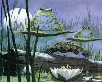
For today I have a card that was inspired by David Wiesner's children's book 'Tuesday'. The amazing talented author and illustrator has won the prestigious Caldecott Medal for Tuesday in 1992. And not only that, but it is still one of my favorite books for children.

Wikipedia description:
Tuesday is an almost wordless picture book. The story contains only six words and three points that determine the time of the action. The whole story is narrated by colorful pictures of frogs flying on their lily padsThe story begins on “Tuesday evening, around eight”. (Source)


Image Source
I used his amazing watercolor as the inspiration for this card and thought it would be perfect for the Make My Monday challenge. Their theme is 'A Scenic Card' I hope you like it.  


This card is quite big 6"x 4" to balance the
image I cut the scene into panels
The pond was easier then I thought. Sponged
Distress Ink and used a water pen to dilute the ink

Detail showing the use of foreground, mid-ground,
 and background 
Hang in there was the subject of the card.
The recipient was having knee surgery.
So this how I did it:
  1. Die cut a circle to use as a mask for the moon. adhered
  2. Using Distress Ink I sponged the sky (Chipped Sapphire) starting at the top and working my way down. The water I started at the bottom then working my way up mixing greens and blues. Forming a horizon line.
  3. Using an aqua pen I spread water over the pond to create water effect. 
  4. Hand drew the willows in the background
  5. Stamped the foreground plants and dragonflies in black and some grasses in green
  6. Stamped and colored the frogs and fussy cut around them. set aside.
  7. Took the moon mask off
  8. Adhered die cut branch and cut the panel into 3 sections
  9. Created card base and added a heat embossed grass in white for texture (hard to see).
  10. Adhered frog with dimensional adhesive then placed the panels on the base. DONE! Phew..
As this card was pretty involved, using the book 'Tuesday' was all the inspiration I needed. Considering the detail of this design, I created this card relatively quickly. When it is right it just goes.. Love it!!

Well that is it for me I hope you enjoyed this post! Thank you so much for stopping by and we will see you again tonight!!

All the best,
Shawna


Tuesday, March 17, 2015

Happy Camper and 2D maps!

Hello to everyone!
Now that the weather is warmer and the sun is out it makes me think of popping up our camper for another year of.. Well... Fun! This is the third year we have owned our camper and we just love it. I have a camper stamp (of course) and thought it would be a perfect time to use for the Crafty Creations Challenge.

Blog Badge
Entering Crafty Creations Challenge #284Sketch
I stamped the road map with the soon-to-be colored road panels; leaving the bottom white per the sketch. Colored the panels and mounted them on dark brown CS. Then stamped and colored the camper then added a banner behind the image. I added a brown stripe for a division between the map and white space. Assembled the card added the sentiment cut it into a banner, adhered it and added a dot embellishment. DONE!

Well here it is I hope you like it.

A road map to celebrating good times!
Card size: A2- 4.25" x 5.5"
Left the bottom white per the sketch.
Do you remember 2D navigation systems called maps!! You know the ones, you unfold them upside down and try to figure out where in the $%&* you are; and when it is time to refold well... Good luck with that. It usually ends up something like a wad in your glove-box along with 5 other state maps you also couldn't refold.

Well I love maps and thanks to my eighth grade Geography teacher I DO know how to refold them. Thank you Mr. George!

So when I saw the road map stamp from Inkadinkado I just had to have it. The blocks of color could mean anything from neighborhoods, parks, rivers, highways, to industrial property, who knows. I just let my imagine run a muck.

The camper is a perfect compliment for the center image of this card.  Road trips and campers go hand-in-hand. I am sure at one of you have a story to tell about road-trips. In the end however, it is all worth it because you have excellent family time and memories to recall for years to come.

Well that is it for me.. I hope you have a good night!

Take care and all the best,
Shawna

Sunday, March 15, 2015

Colorful Hibiscus.

Aloha everyone!
Tonight's card will be entered in the CAS-ology challenge with the cue card: tropical. I have also decided to join the Mod Squad Challenge and Virginia View Challenge.

Entering Challenge CAS-ologyCue card: Tropical
Share Our Badge on Your Blog!
Entering Challenge Mod Squad Challenge: Flowers
Entering Challenge Virginia's View #13- Everything Embossed
To me, nothing says tropical like a larger then life hibiscus. This flower shimmers with pinks, purples, whites, yellows, and greens from Perfect Pearls by Ranger. I hope you like it as much I liked making it.

This card shimmers with Perfect Pearls painted
inside the white embossed hibiscus.
Stamped the flower again on the purple background
and used dimensional adhesive for the color hibiscus.
Lots of dimension without the bulk.
The sentiment 'Mahalo' is a Hawaiian
word used when thanking someone.
This card took a lot of experimentation. I have never worked with Perfect Pearls before and thought this project would be perfect for me to see what all the fuss was about. Well now I understand, and just love how it turned out. Anyone who has worked with this medium understands that the picture doesn't do it justice on how it just shines! It is truly an amazing product.

So this is how I did it:

  1. stamped this jumbo hibiscus stamp on purple CS and heat embossed it white. 
  2. Then colored the flower with Perfect Pearls and water. What fun!
  3. Then did a little fussy cutting around the hibiscus and set it aside.
  4. Stamped the same flower image on the same color paper but in black. 
  5. Traced a die cut and cut out the scallop and mounted it on another shade of purple paper and outlined the scallop.
  6. Mounted it on white CS leaving the some of the white exposed.
  7. Stamped the sentiment, die cut it oval, then added pink pearls. Adhered it to the card.

This card really surprised me in the fact that I couldn't believe how it turned out.  I was just expecting to fiddle around with Perfect Pearls but when all was said and done I came up with this shimmering gem of a card.

That is all for now I hope you enjoyed this post.. Leave me a comment and let me know what you think.. I really enjoy what you have to say.

Aloha everyone! (meaning both hello and goodbye)

All the best,
Shawna

Saturday, March 14, 2015

Poppies

Hello Again!

For this post I am entering (unlike my last post) Always Playing with Paper Challenge. I really like this blog because their challenges are like a one-stop shop.  In that they give you a color and sketch challenge. 

Entering challenge Always Playing with Paper #26
This card features lots of poppies and when I say a lot I mean it. Each poppy was colored by the now discontinued Stampin' Up! Blendabilities markers. Which is too bad they seemed to be such a good product. And knock on wood I haven't had any issues.

On with card, first I used my teal CS and bleached it using the Hardwood Stamp by Stampin' Up! then distressed the edges. For the poppies, I colored and cut each flower and assembled them to form a bouquet-like configuration. Added the gray banners using patterned paper for interest and the sentiment banner plain white. 

Stamped wood background using bleach.
When bleaching CS you never know what color you will come with.
In this case it turned out perfectly! Phew!
Card Size: A2- 4.25" x 5.5"
The layers of poppies and banners intertwine
for a more cohesive look. 
The layers of poppies add tons of dimension. However, I didn't want to adhere the poppies then banners on top. Instead I layered the flowers with the banners. This way the banners wouldn't hide too much of the poppies. As for the color combination, I just think it is wonderful and will definitely be used again! Well I guess I am short and to the point tonight.. I hope you have a wonderful night and we will see you real soon.

All the best,
Shawna

Thursday, March 12, 2015

'Watercolor' Bouquet

Hello All and welcome!!
For today I have a card for two challenges.  I picked these challenges because of the soft colors and gentle tones.  The theme for The Card Concept #30 (Thinking of You) is perfect for the Paper Players color challenge #235. Sometimes when you want to tell someone you are on their mind the tone of the card can make all the difference. In this case it could be for someone who is having a rough patch with life.

Entering Challenges:
The Paper Players color challenge PP235
The Card Concept #30 - Thinking of you


My husband always makes me smile. There has been times that he has told me he is so glad I do this because he doesn't ever have to pick out a crummy card again. These are made with the heart not mass production. So here we are: I hope you like it...

Colors are subtle and set the tone for the
sentiment.
Card Size: A2- 4.25" x 5.5"
  
 These two photo are showing the details of the bouquet

The flower bouquet is colored with a technique called faux watercolor.  Ink pads and a water pen is all you need for this result. Simply dab your pen on the ink pad to lift the color then apply it directly to the paper and let the water from your pen spread out the color; it is easy to control and the effect is amazing!

So first I heat embossed the bouquet by Stampdenous then used some ink pads (not pigment) and aqua pen to apply the color. Cut out the image.

For the background I used Stampin' Up! Hardwood, Off the Grid (retired), and Wetlands for the sentiment. Sponged the edges with brown and melon inks. Stamped the medallions by Technique Tuesday in the same brown. Used dimensional adhesive to raise the bouquet off the card; added the brown banner with sentiment. DONE!

Well I should probably get to bed. Thank you for stopping by and we will see you soon! Oh yeah, don't forget to leave a comment, they make my day.

All the best,
Shawna

Tuesday, March 10, 2015

Simply Adored.

Hello again!
Today I am submitting a card for Simon Says Stamp Wednesday Challenge themed Special Lady/Girly. Yesterday I created a card that is masculine and today it is feminine. I hope you enjoy it!! I am saving it for my daughter's 10th birthday.  She has been asking for it ever since I made it..

An unusual way to use the Hardwood stamp by Stampin' Up!
Card Size: A2 5.5" x 4.25"
What a sweet little girl colored in soft tones.
I am just in love with this sweet little girl.. I saw this Penny Black stamp at a craft store and had to have it.. So I waited a few weeks and still had to have it! So here we are and that is what directed the entire design of this card.  Very simple design yet very effective. Hence my daughter wants it.. LOL... 

I took pink CS and heat embossed using the Hardwood stamp by Stampin' Up!.  I think this detail is very important because it adds texture and interest to an otherwise plain background.  Using pink for a backdrop with a wood stamp I think is fairly unusual, I just love it.. However, I didn't really want the embossing to shine so I ironed off most of the sheen.  

Then I stamped the sweet girl and colored her in using my Prismacolor pencils. I kept her sketchy and free to show some whimsy. I then die cut a heart around the girl traced the heart with marker and ever so lightly distressed the edges in brown. Lastly I added the 'Simply Adored' sentiment which, I think, sums up the entire card. 

Die-cut some hearts using a die from the then LifeStyle Crafts in dark magenta to play off the color of the dress. Small hearts scattered throughout the card is the perfect touch. No distracting bling, glitter, or pzazz.. Done!

I hope you enjoyed this post! Let me know your comments; I just love hearing from you.. 

All the best,
Shawna

Bang! Boom! Kapow!

Hello everyone,
Another sunny day here in MI! Not only was it sunny but it was warm (well for our standards at least). It is getting me ready for summer and fireworks! Which brings me to my card for tonight. It is a masculine birthday card that I am entering into two challenges. The Male Room had an awesome sketch challenge and Seize the Birthday's topping is 'Masculine'.


Sketch challenge: The Male Room Challenge #5
Seize the Birthday challenge Toppings: Masculine
So here we are my masculine birthday card!

Tried to keep it cartoon like. Bold colors and interjections
make this birthday card.

The inside panel shows the negative
image of the skyline bringing the comic book theme throughout the card.
A close up image of the front panel
Card Size: A2- 4.25" x 5.5"
As you can see tonight's card is very graphic. I wanted it to resemble a comic book. The bold colors, stars, interjections, and the red 'Wish Big' bubble have all the markings of this cartoon'ish look.

Per the sketch from The Male Room I kept all the color on the diagonal which really leads your eye downward toward the 'Happy Birthday' sentiment.

The skyline is another piece that just makes this design so cartoon like. The positive area was used on the front and the negative was used for the inside. Perfect for a message and carries the theme throughout the card.

The upper right corner needed 'something'. So in keeping with the booms, kapows and bangs fireworks were added using VersaMark ink.  Didn't need it to be competing with the color and I think the watermark did just the trick. Done!

Thank you so much for stopping by tonight. I hope to see you soon..

All the best,
Shawna

P.S.
Oh yeah... One note to self, never try to heat emboss where you just applied spray mount! I know all you veterans out there are laughing because (I hope) you have done it too. I just put the skyline down and then without a thought applied my anti-static stuff and stamped. So far so good, till the embossing powder was sprinkled on.. AHHHH! What a mess.. But I did the best I could.. I am hear to say that will NEVER happen again! Lesson learned..


Sunday, March 8, 2015

Calm meadow

Hello!
I hope today everyone in my neck of the woods has thawed out just a bit. The warm sun and well, just seeing the sun, felt soooo good.  Why not create a card for Spring?  So, for today I have a card for the Hand Stamped Sentiments challenge. 
Entering Challenge:
Hand Stamped Sentiments: HSSSC206
This sketch challenge has been on my docket for awhile now, just sitting there staring at me waiting for a design. Well inspiration came and here it is.  

The soft color palette is just
perfect for this sweet, sweet little girl.
Keeping my coloring sketchy aligns with
the sketchy image.
The sponged edges of this tag
gives the impression of sky. 
I simply adore how this turned out. The little girl from the 'Summer by the Sea' set by Stampin' Up! (retired) was the driver for the whole design. She is just so sweet and had to use her on this card.

When coloring the image I originally used gamsol with my Prismacolor pencils to soften the lines of the pencil strokes but found it to be too smooth and blended.  So I tried again, but this time I omitted the gamsol and kept the pencil strokes. It now has a sketchy feel like the image that was stamped. It just felt right!

The patterned paper I chose was meant to be for younger children, like our little girl. It actually reminds me of wallpaper that was in my room when I was a little girl. The banners also work very well with our soft color palette. 

The girl is assumed to be staring at the birds wondering, or perhaps, saying goodbye, so what better sentiment then 'All the Best'. 

Topping the tag with a pretty polka dotted bow by Stampin' Up! is just the right touch to finish off this card. 

Well that is all for now. Thank you so much for stopping by and we will see you soon with another challenge from TheGrandStampede!

All the best,
Shawna